Client:
The Design Museum North - the newly established Design Museum in Cardross linked with the Moa Museum in London and the V&A Museum in Dundee.
Project Brief:
The project brief was to create a brand of newly established Design Museum which will be located in old bulding in Cardross near Glasgow.
The Concept:
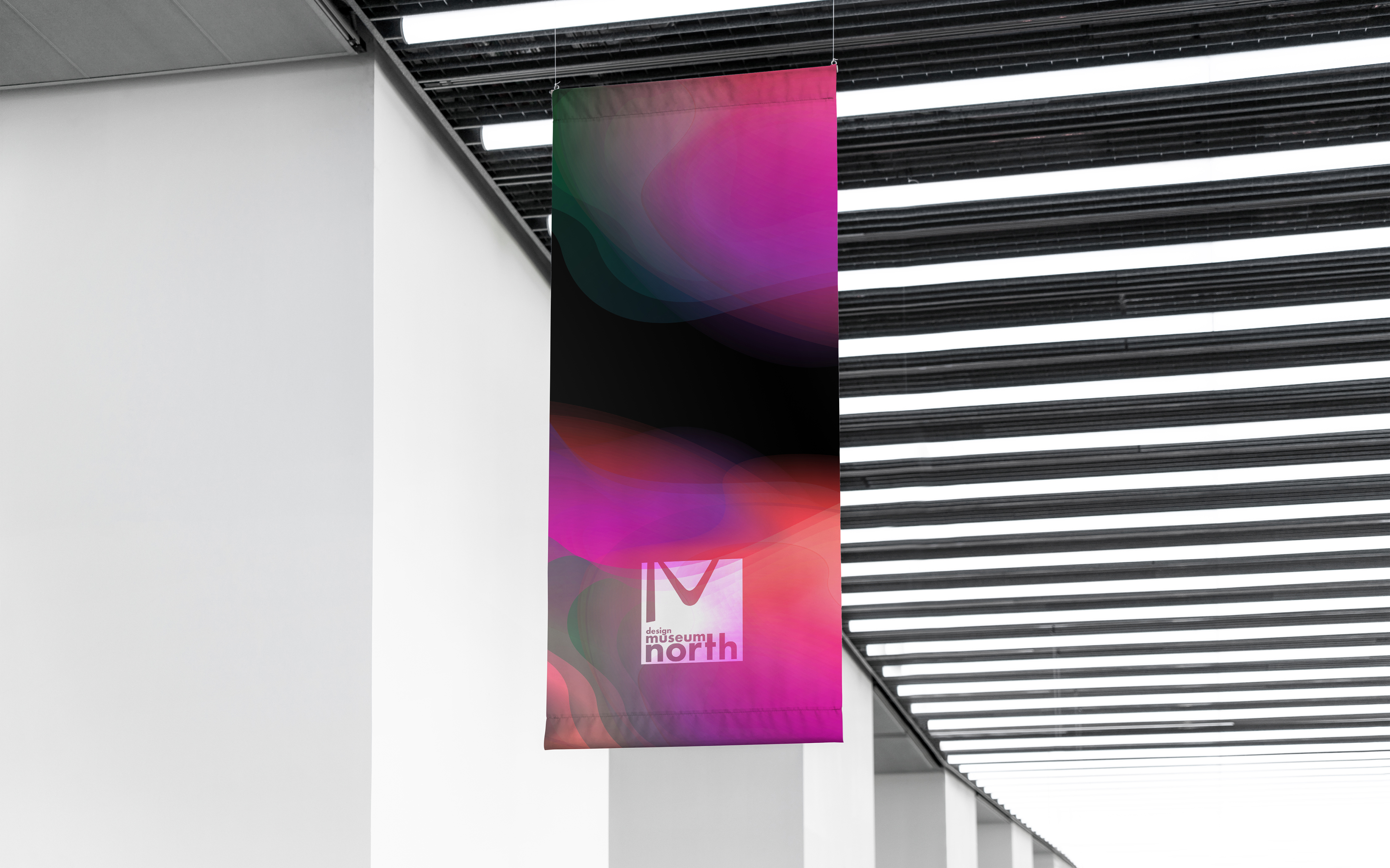
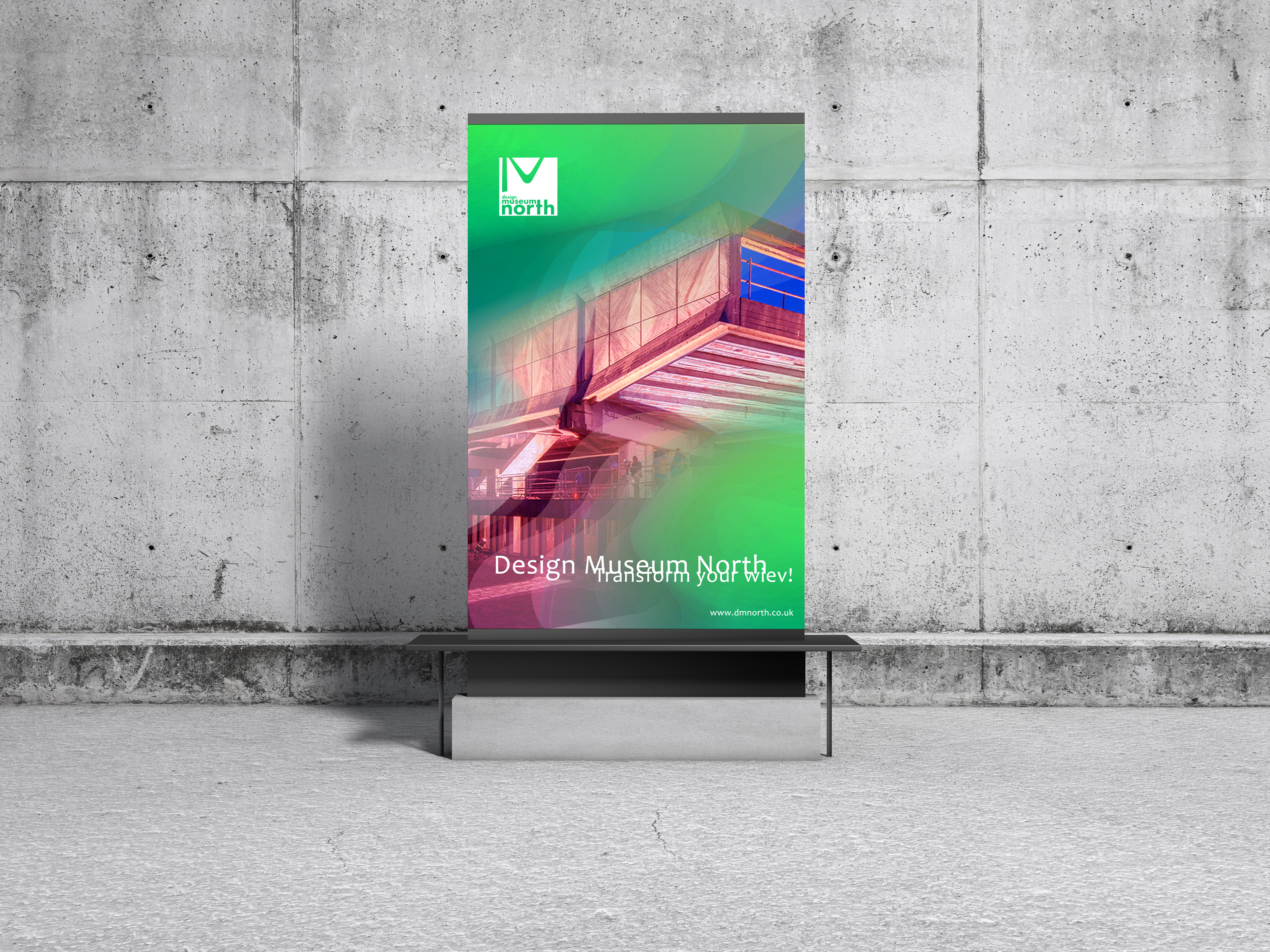
The main aspect for the brand identity concept is to show and represent vision of transformation. The concept was inspired by dynamic and vibrant transformation of colours in the northern lights, which also links with North. St Peter’s Seminary building wasn’t just randomly chosen as a host for art exhibition before. Building was inspired by a known modernist and brutalist designer “Le Corbusier”. His vision of natural light manipulation had impact on the raw look of the building with multi sized and asymmetric shapes and windows. Transformation of light influences how we see space around us, it also changes our point of view. Analising the building we can see architectural solutions where light changes the brutalist style of the interiors into rooms filled with specific mood, focus and atmosphere/ambience. Brand will represent transformation of building architecture, also spectrum and vision of natural light in nature and will links to colorful light reflection in Northern Lights.
Brand Vision:
Brand vision is to build a network of Museums which will get people closer to Art and Design, so as those areas will impact our awarness and daily life.
Brand Mission:
Brand mission is to create a sense of aesthetics of the 21st century to influence the consciousness of people who spend time in the museum, so that they can create inspired by modernity.In our exhibitions we want to show the transformation that is taking place in art and design so that it motivates to change existing trends.
Brand Values:
Forward Thinking, Modern and 21st Century
Colours:
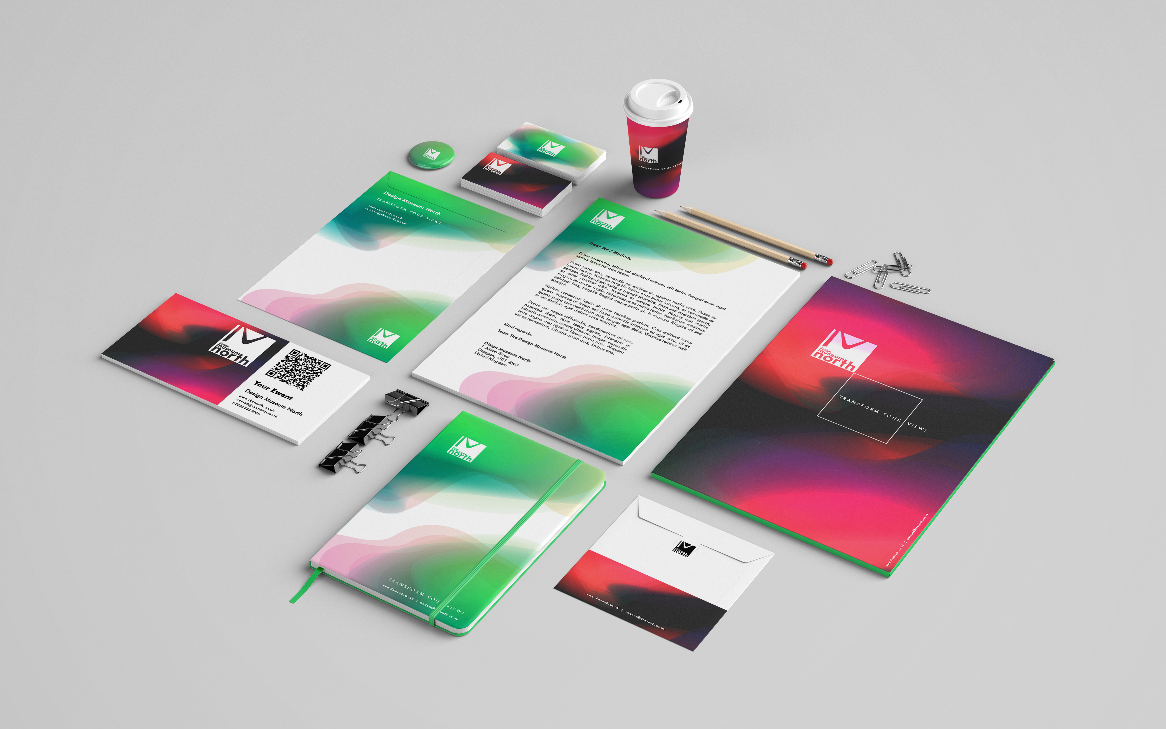
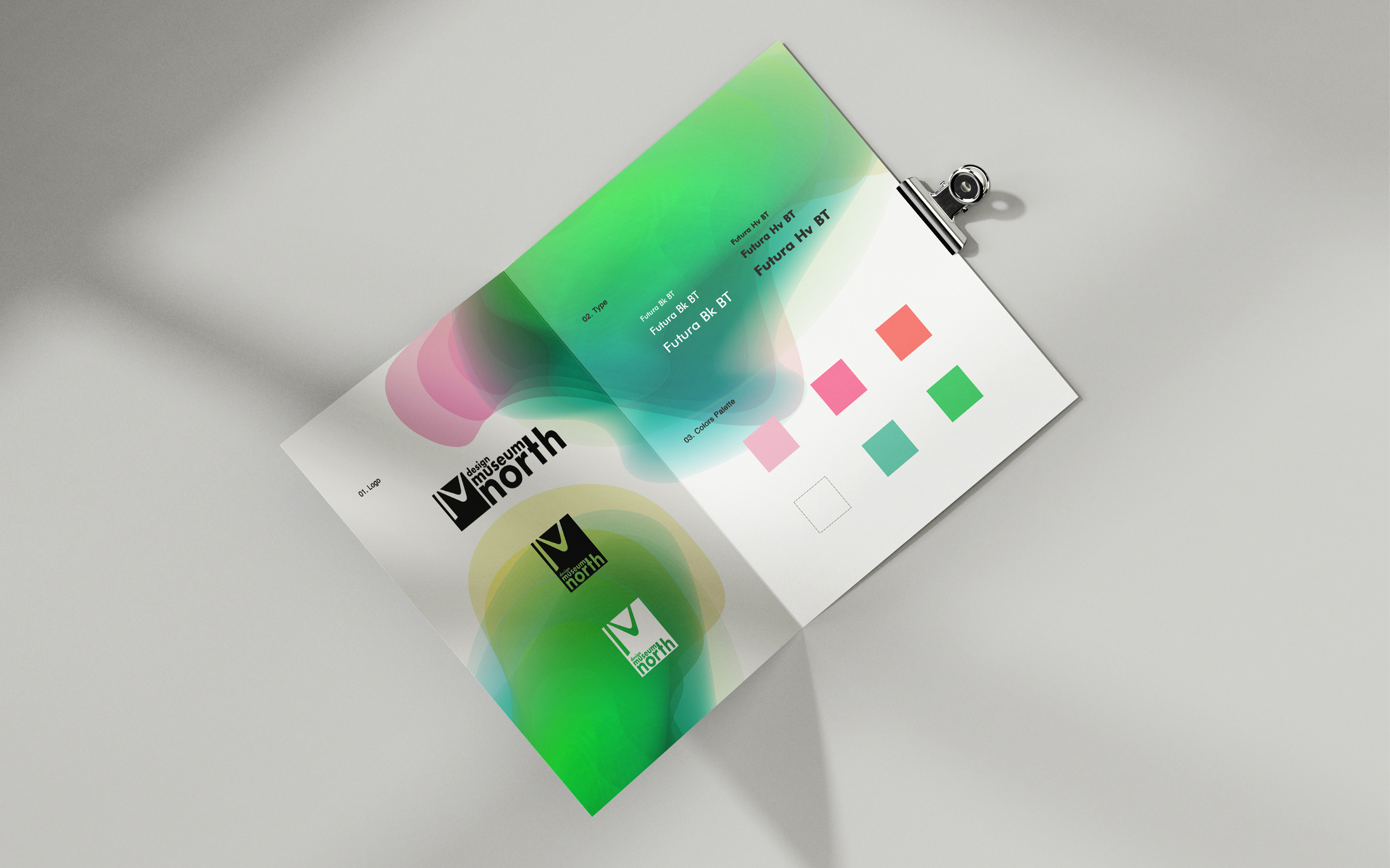
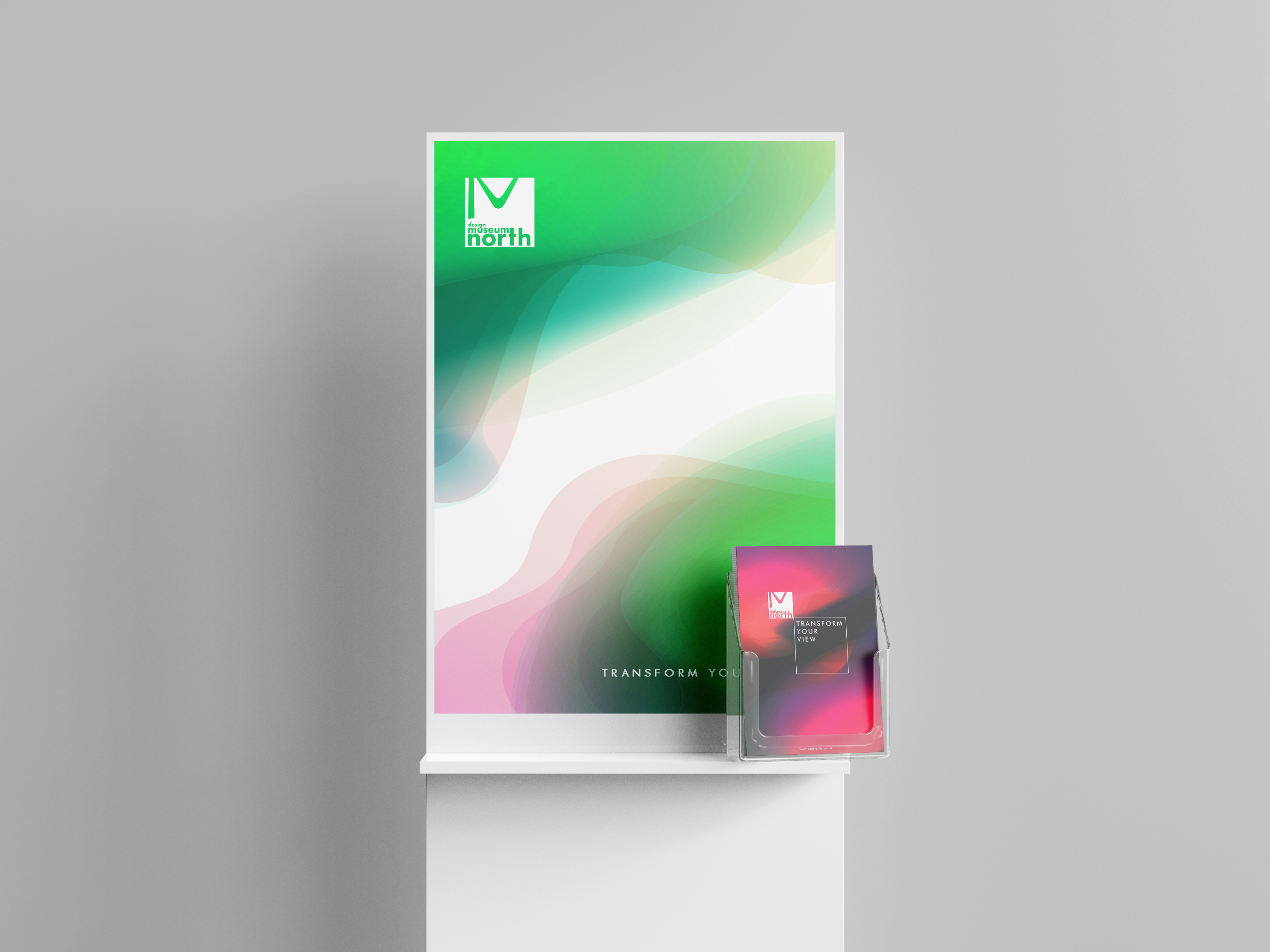
Colour pallete comes from Aurora Borealis and from colour pallete designed by “Le Corbusier”. No other colours should be used. Colours can be manipulated by transparency using opacity as shown on the artworks background in the guidelines. The main background colours outside of the pallete are black or white and these can be used together on posters, stands, business cards or website etc. For the background also gradient colours are allowed from available palletes.
Patterns and Shapes:
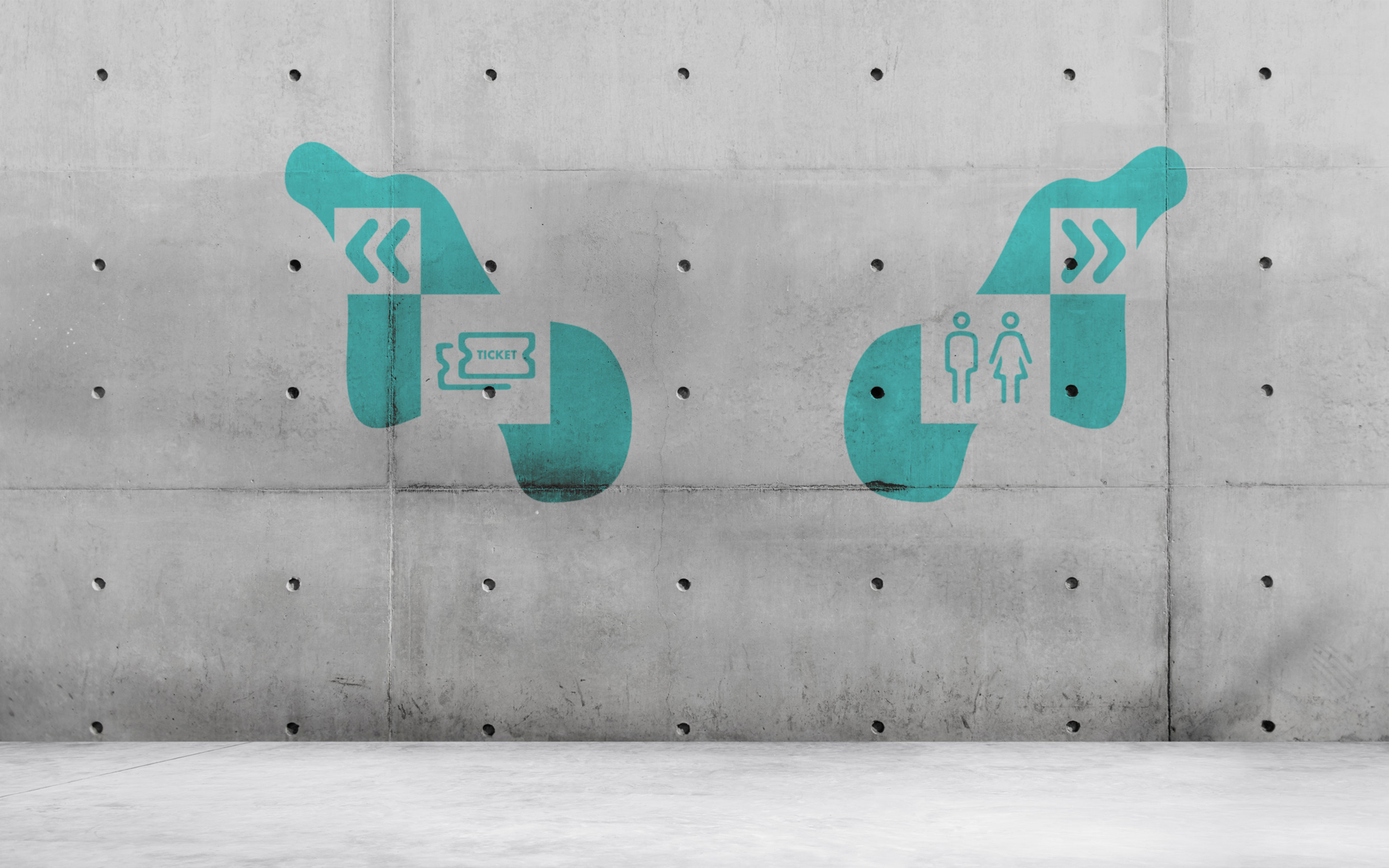
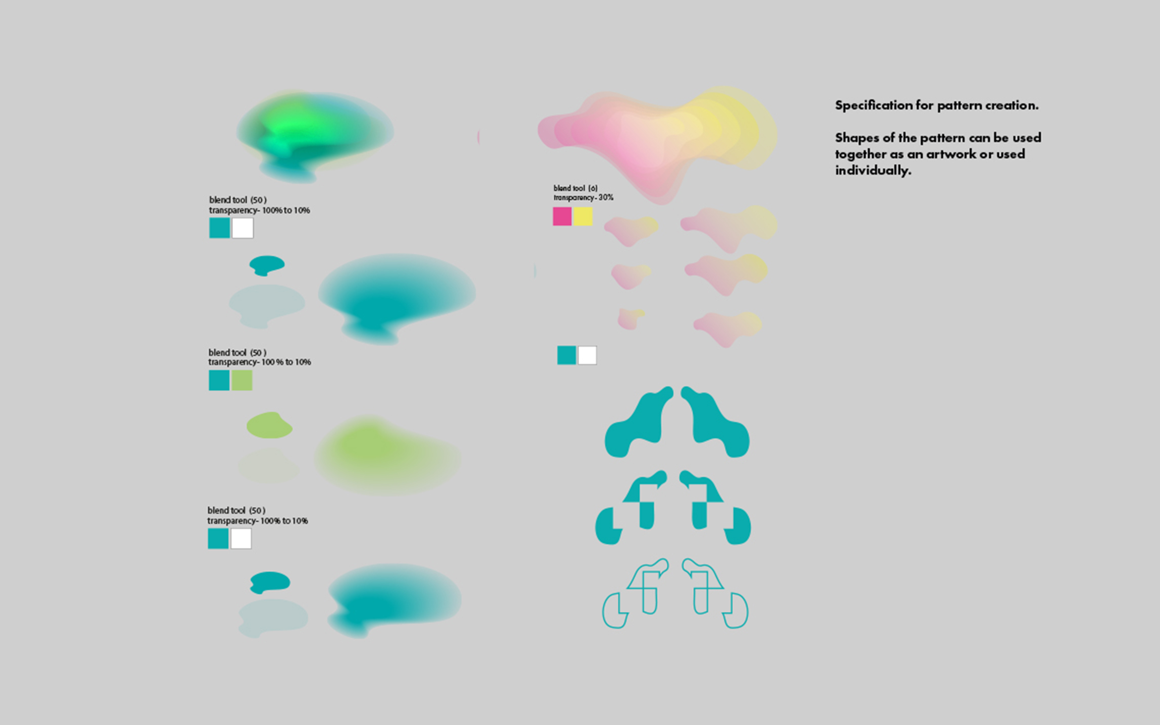
Patterns and Shapes are inspired by Aurora Borelis shapes.
Logo:
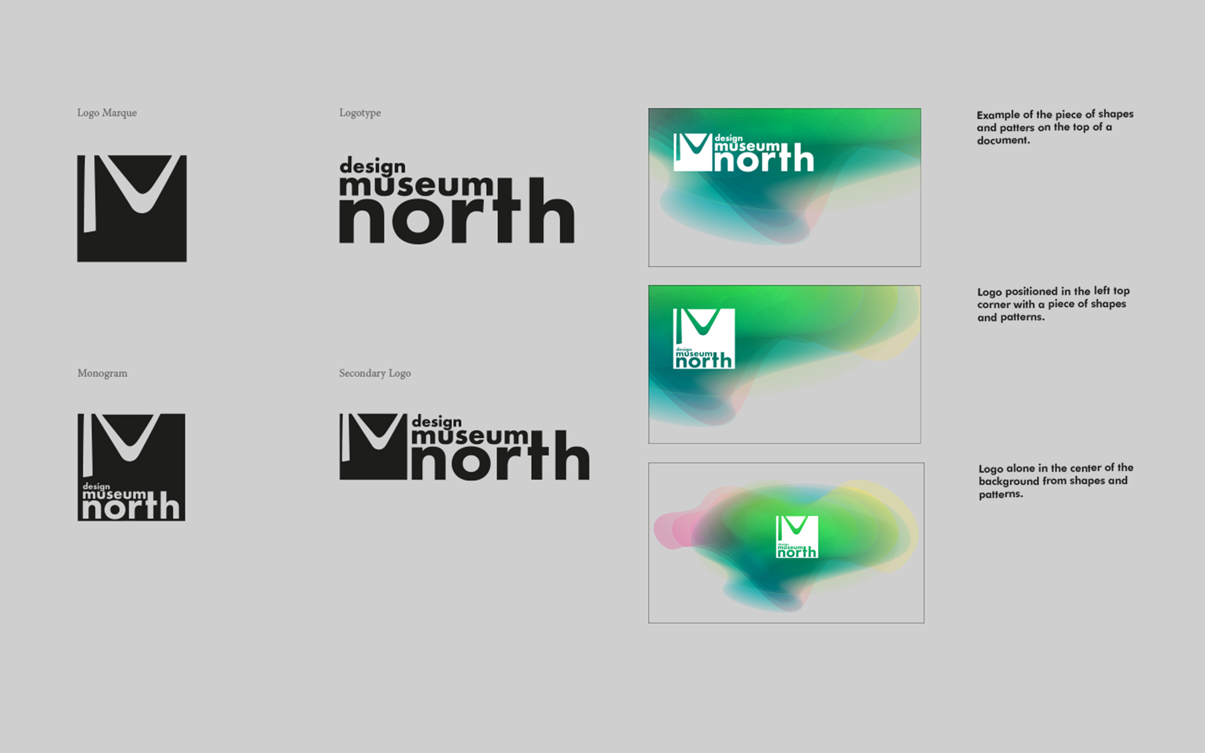
The logo marque is combination of Art and Typography and consists of shapes of the building which links to Northern Lights.
Category / Date
For commercial use / 20.05.2020
