Client:
The G.F Smith - The number one UK paper company offers services with 136 years of experience in creating high-quality paper products and publishing services.
Project Brief:
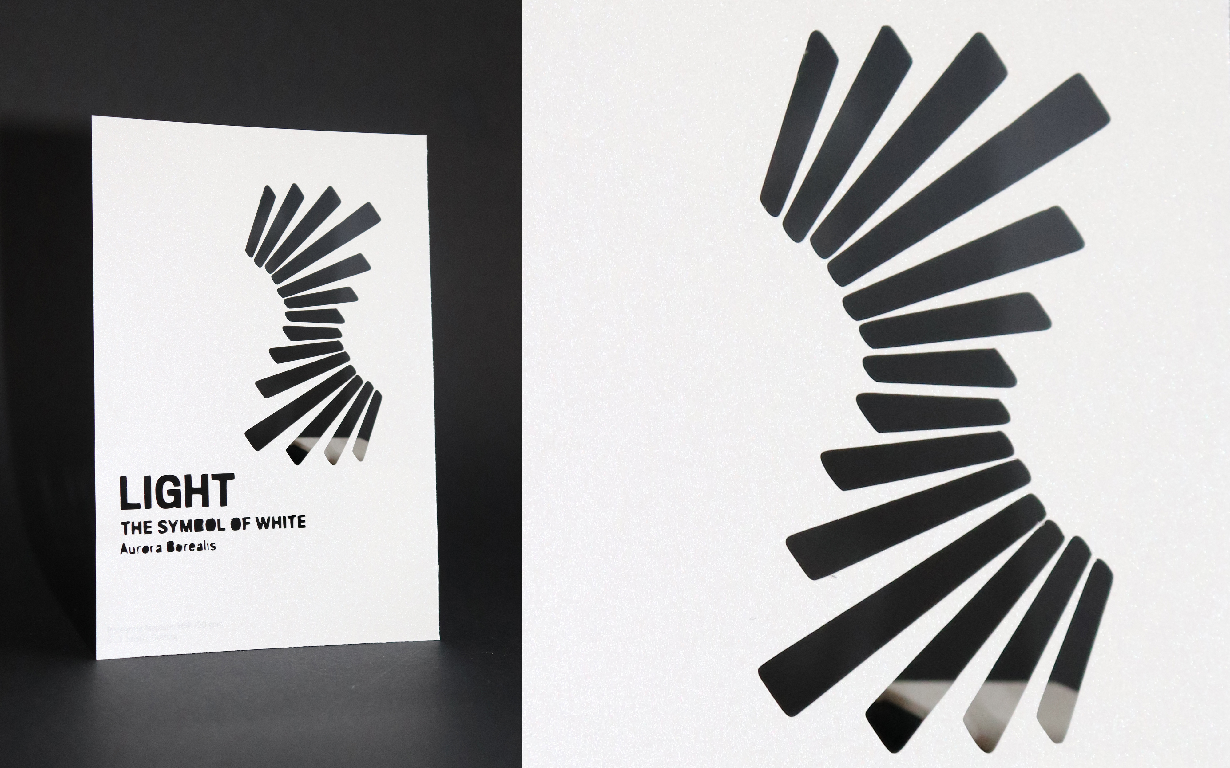
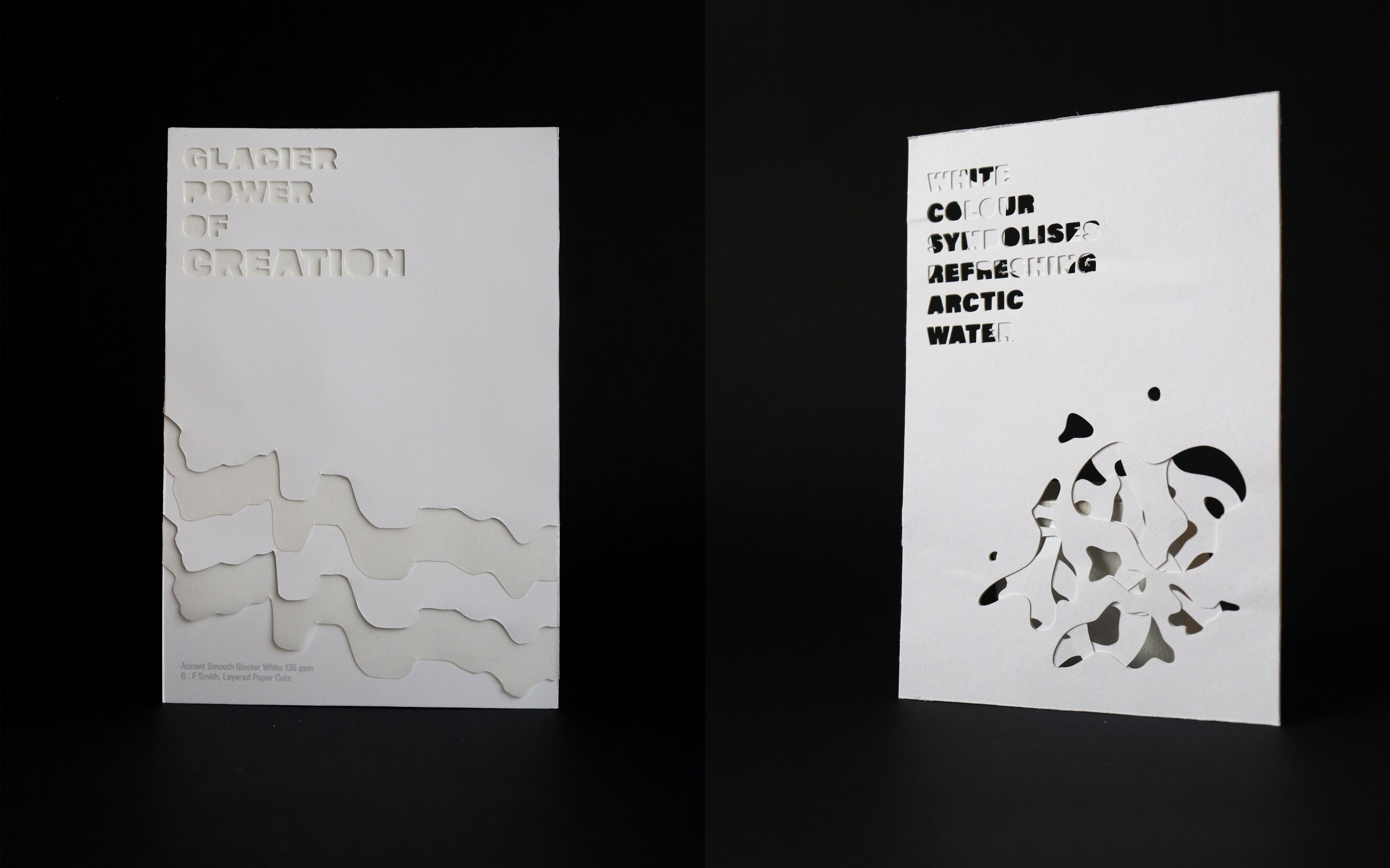
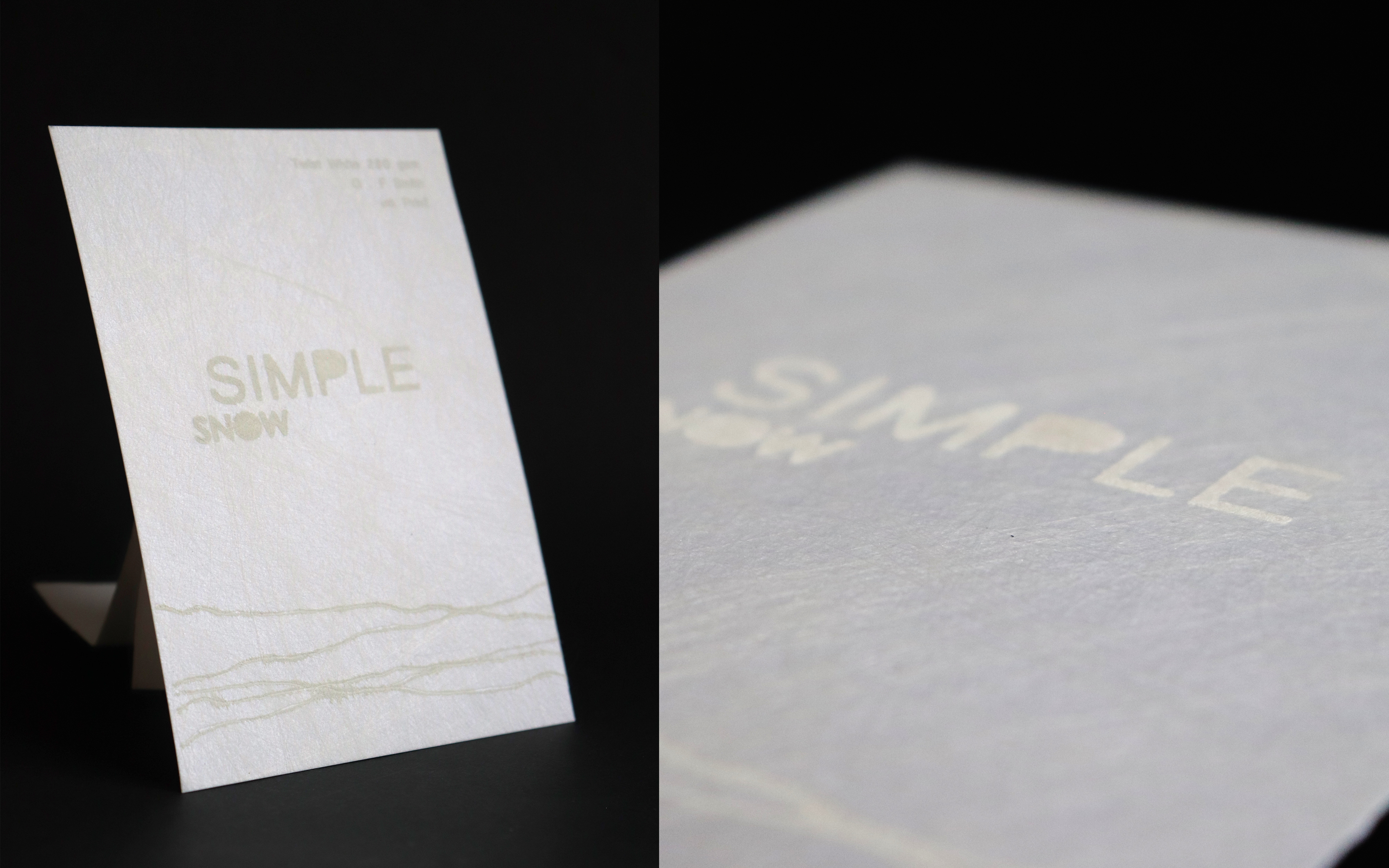
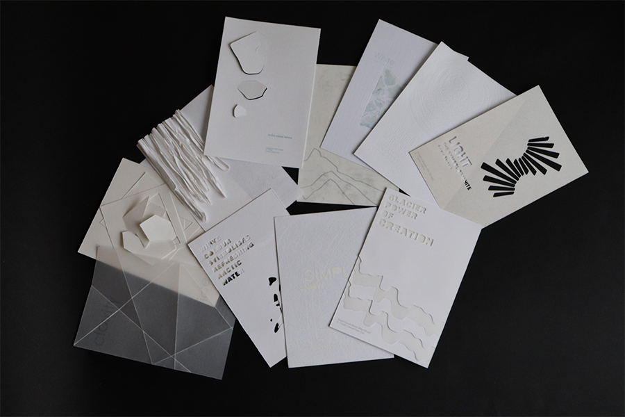
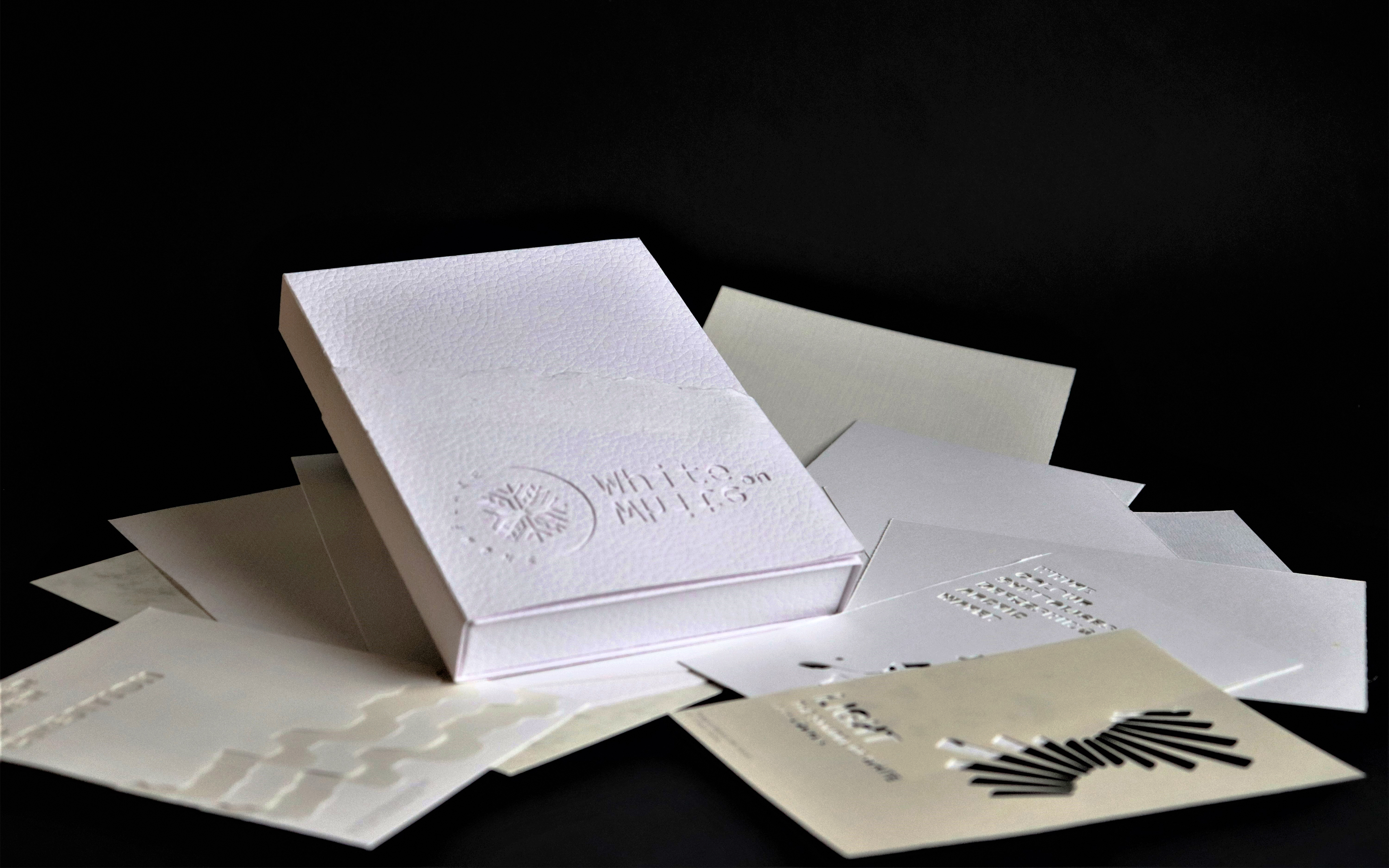
The project brief was to create a promotional pack that houses a range of 12 G.F. Smith paper samples and box, each using a different brand and weight of G.F Smith paper. The promotional pack represents perception and symbols of white color in the symbols of winter and the elements of nature using different papers in white shades, method and printing techniques.
Concept:
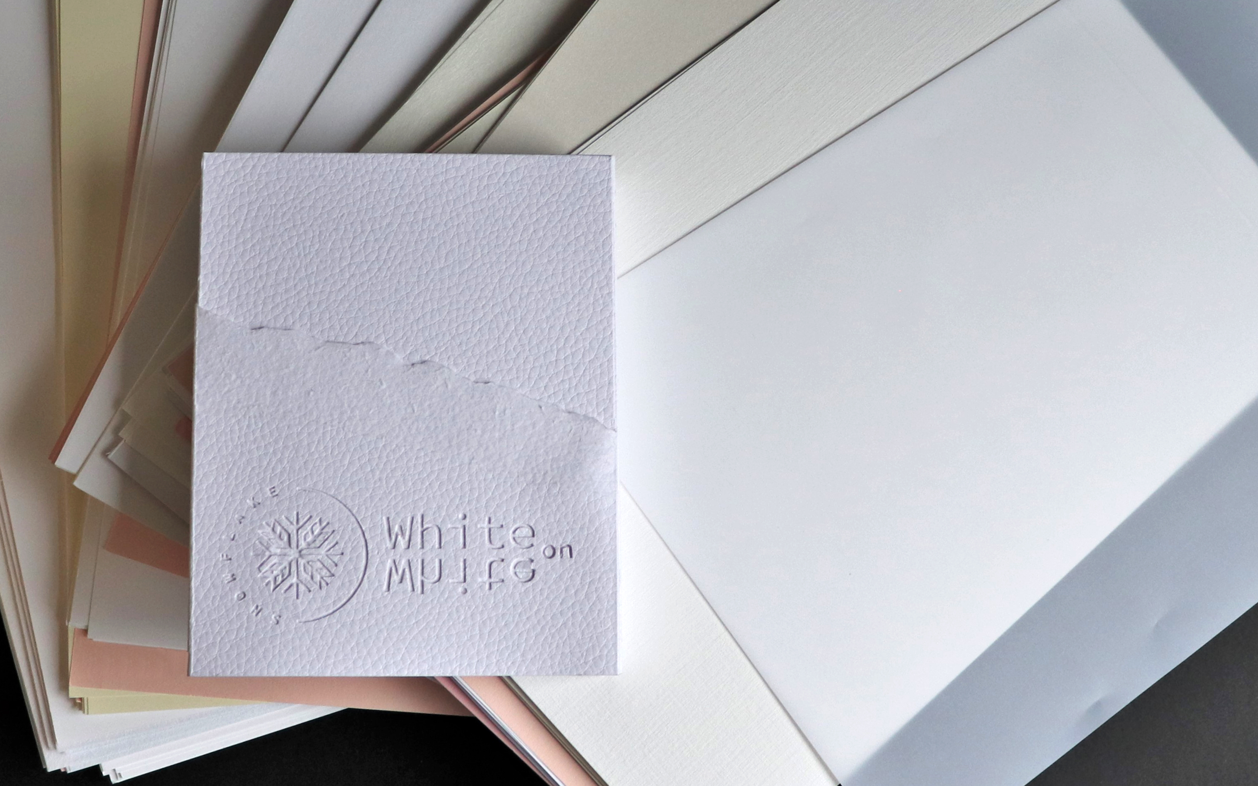
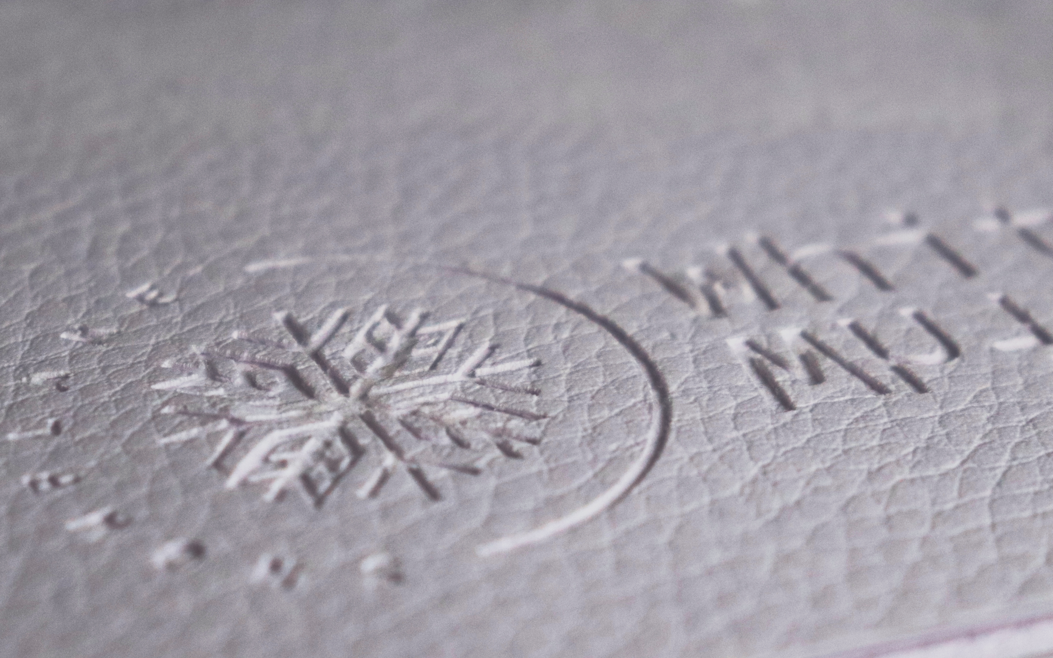
This concept presents natural attributes that are corresponding to the perception of white color. White is associated with coldness, so the design kept in cold colors, symbolizing coldness. For the project, I used a minimal and abstract style of lines, dots, and shapes. The project is a combination of printing techniques, such as emboss, deboss, foil print, hot press, cut print, folding. The packaging is in a simple, classic style of the folding, cutting style.
Target Audience:
The target audience for this project is anyone who specifies paper - Graphic Designer, Art Directors, stationers, printers, and more.

We have been obsessed with the simple beauty and limitless possibility of paper.
G.F Smith - 135 years
